How to Create a Brand Identity Graphic Design

A new logo rarely solves the real problem. Most organizations that ask how to create a brand identity graphic design system are not actually asking for visuals alone. They are trying to resolve inconsistency, sharpen market perception, align newly merged businesses, or give growth a clearer shape. The graphics matter. But they only work when they express something true, differentiated, and durable.
That is where many identity efforts go off course. Teams start with colors, references, and mood boards before they have defined what the brand must mean to buyers, employees, partners, and increasingly, AI-mediated discovery systems. The result is often polished but thin – a visual layer applied to a strategic gap.
How to create a brand identity graphic design system that holds up
Brand identity graphic design is not decoration. It is the formal expression of brand strategy through visual language. Done well, it gives an organization coherence across every touchpoint, from investor materials and product interfaces to recruitment campaigns and sales decks. Done poorly, it creates inconsistency at scale.
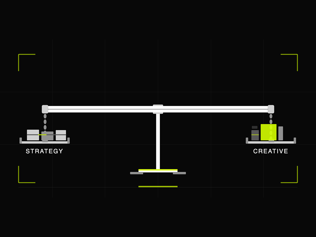
The work begins before design. Leadership needs agreement on what the brand is, what it is not, and what role it must play in the category. If that sounds obvious, it is. It is also the discipline most often skipped.
A credible process typically moves through five decisions: define the brand core, translate it into visual principles, build the identity system, test it in real conditions, and govern it over time. Each decision affects the next. None can be outsourced to taste.
1. Define the brand core before designing anything
A visual identity cannot compensate for an unclear brand position. If your organization is entering the U.S. market, integrating acquisitions, or moving from founder-led growth into a more mature operating model, this step is not optional.
Start with the central questions. What distinct value does the organization create? What beliefs shape how it behaves? What should audiences consistently feel and understand after any meaningful interaction? This is the strategic substrate behind the design system.
At this stage, the goal is not a tagline or a style direction. The goal is clarity. Many leadership teams discover they are using the same words to mean different things. That ambiguity eventually shows up in the design. A brand that wants to look both disruptive and deeply established, or both premium and radically accessible, will produce unresolved creative work because the underlying choices were never made.
This is also the point where trade-offs become useful. Not every brand should signal energy. Not every enterprise brand should look conservative. The right answer depends on category expectations, audience psychology, business ambition, and the degree of distinction required.
2. Turn strategy into visual principles
Once the brand core is defined, the next task is translation. Strategy does not become design through instinct. It becomes design through principles.
Visual principles are the bridge between positioning and execution. They define how the brand should show up rather than just what assets it should use. For example, a brand may need to feel precise, human, and decisive. Those are not design elements, but they can guide design choices. Precision may suggest disciplined typography, structured spacing, and a restrained palette. Human may call for warmth in imagery, language, and motion. Decisive may require stronger contrast, clear hierarchy, and fewer ornamental moves.
This is where senior teams often make a costly mistake. They evaluate early design based on preference instead of principle. “I like this one” is not a useful criterion. “This better expresses our strategic intent and creates stronger recall in-market” is.
Strong visual principles also create alignment across internal stakeholders. Marketing, product, HR, investor relations, and sales do not all need to become design experts. They do need a shared understanding of what the brand’s visual language is meant to do.
The core elements of brand identity graphic design
After principles are established, the identity system can take shape. This includes the logo, typography, color system, imagery style, graphic devices, iconography, layout logic, and in some cases motion behavior. These elements need to work as a system, not as isolated parts.
The logo matters, but it should not carry the entire burden of brand recognition. In mature identity systems, recognition comes from the combination of assets used consistently over time. Typography can often do more strategic work than executives expect. Color can create memory quickly, but only if it is distinctive and used with discipline. Imagery can either reinforce the brand’s point of view or dilute it through generic visual conventions.
The right system is not always the most complex one. Some organizations need a broad toolkit because they operate across diverse channels, business units, and geographies. Others need a tighter framework because internal teams will struggle to manage nuance at scale. A simple system, well governed, often outperforms an elaborate one that no one can implement consistently.
There is also a practical question many teams miss: how flexible should the identity be? A global enterprise with multiple sub-brands, product families, and stakeholder audiences may need a more modular system. A focused category leader may benefit from tighter control. Flexibility is not a virtue by itself. It is a response to organizational reality.
Design for application, not presentation
Early concepts often look strong on a presentation slide and weak in the market. That happens when identity work is evaluated as art direction rather than operational infrastructure.
A serious brand identity graphic design process tests the system in context. How does it perform on a website, in social assets, in event signage, in PowerPoint, in product UI, in print collateral, and in AI-generated previews or summaries where fragments of the brand may be surfaced out of sequence? If the system only works in ideal conditions, it is not ready.
This is especially important for organizations with complex buying journeys. Enterprise buyers do not encounter brands in a neat progression. They move across analysts, search, sales materials, peer referrals, earned mentions, product demos, and talent touchpoints. The identity has to create coherence across that fragmented experience.
Build for scale and governance
The strongest identity system fails if no one can manage it. Governance is where brand coherence either holds or starts to erode.
That means documenting standards clearly, but not bureaucratically. Teams need enough guidance to apply the system correctly without slowing execution. Templates, usage logic, approval thresholds, and asset libraries all matter. So does organizational ownership. If no one is accountable for coherence, incoherence becomes the default.
This is particularly relevant after M&A activity or during rapid expansion. Legacy visual habits do not disappear because a new identity has been launched. They persist in sales materials, recruiting assets, regional adaptations, and product environments. Governance has to account for transition, not just end state.
At Starfish, this is where methodology matters. Brand systems endure when they are built from a clear strategic core and structured for real organizational use, not simply unveiled and handed off.
Common mistakes when creating a brand identity graphic design system
Most failures are predictable. The first is designing before strategy is settled. The second is over-indexing on the logo while underinvesting in the broader system. The third is confusing internal consensus with market effectiveness.
Another frequent mistake is borrowing too heavily from category norms. Familiarity can feel safe, especially in B2B sectors, but it usually produces sameness. Distinction does not require eccentricity. It requires disciplined choices that make the brand more identifiable and more ownable.
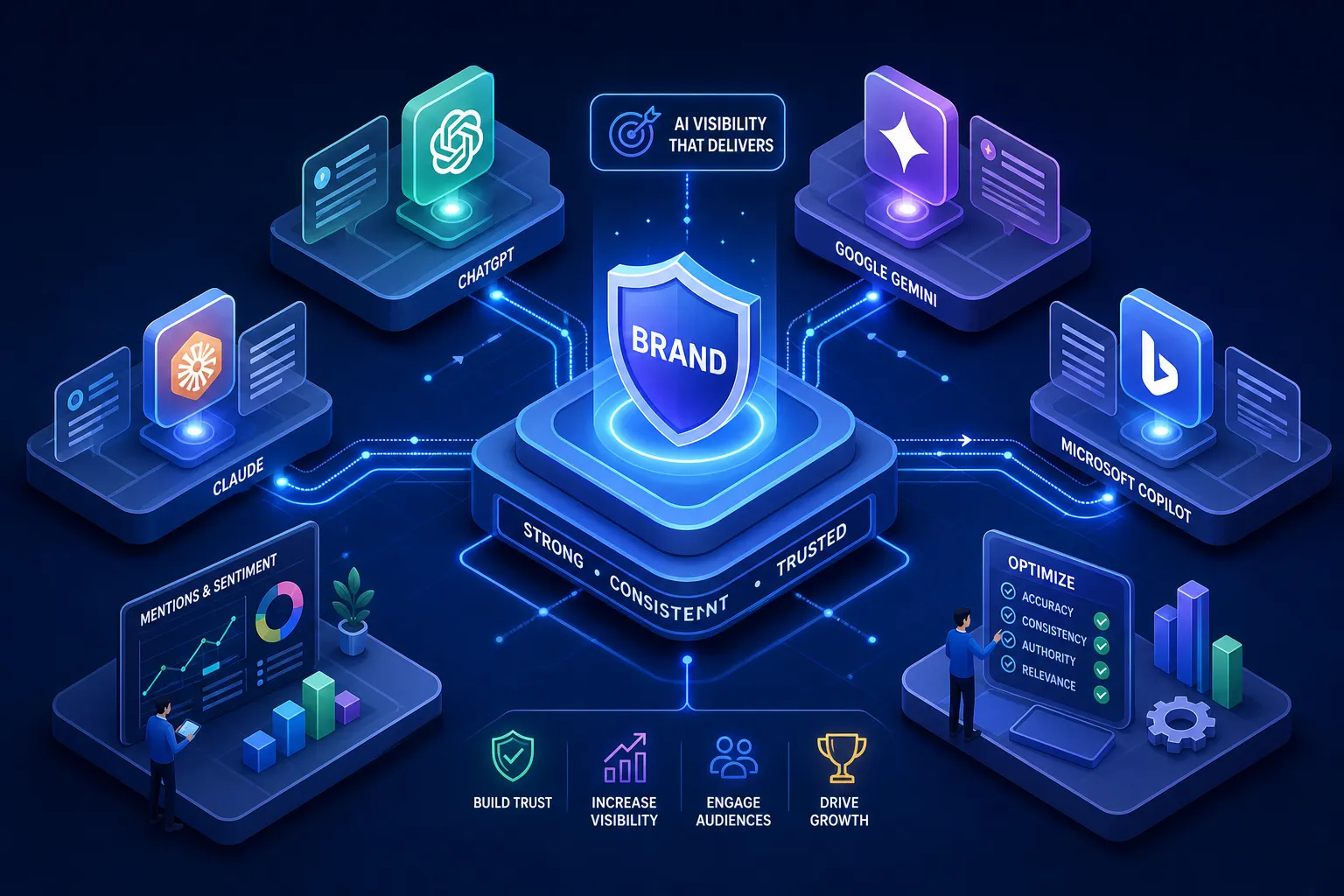
There is also a newer challenge. Many teams still think of brand identity as something primarily seen by humans in polished environments. That is no longer enough. AI systems increasingly shape discovery, summarize companies, generate comparisons, and influence how buyers encounter brands before direct engagement. A coherent identity alone will not solve that, but a fragmented one will make the problem worse.
What good looks like
A strong brand identity does three things at once. It expresses strategy with precision. It creates recognition through repeated, distinctive cues. And it helps the organization act like one brand across many experiences.
That standard is higher than visual appeal. It requires leaders to make clear choices, creative teams to translate those choices into systems, and organizations to apply those systems with discipline. The process is demanding because the stakes are real. When identity is right, it does not just make the business look better. It makes the business easier to understand, easier to trust, and easier to choose.
If you are deciding how to create a brand identity graphic design system, start one level deeper than aesthetics. Ask what the brand must mean, where coherence is breaking down, and what future state the identity needs to support. The design will be stronger for it, and the organization will be clearer long after the launch files are delivered.