12 Visual Identity Graphic Design Examples

A logo can look polished and still fail the business. That is usually the problem when leaders search for visual identity graphic design examples. They are not looking for decoration. They are trying to understand what a high-functioning identity system looks like when a brand needs to scale, consolidate, reposition, or enter a more competitive market.
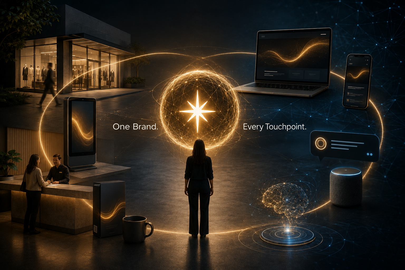
Visual identity is not a mood board. It is the visible operating system of the brand. It translates strategy into recognizable signals across every touchpoint – sales materials, digital products, investor communications, events, packaging, signage, and now AI-mediated discovery environments where consistency affects interpretation as much as aesthetics do.
What strong visual identity graphic design examples actually show
The best examples do not begin with style. They begin with decisions. What must the brand communicate at a glance? What category codes should it use, reject, or reframe? What must remain stable across channels, business units, and regions?
When those questions are answered well, the design becomes more than distinctive. It becomes usable. That matters most in organizations with multiple stakeholders, complex architectures, or accelerated growth. An identity that looks compelling in a launch deck but breaks under operational pressure is not a strong identity.
The examples below are not tied to specific companies. They are patterns senior leaders can use to evaluate whether a visual system is built for performance or only for presentation.
12 visual identity graphic design examples worth studying
1. The reductive identity
This example strips the brand to a small number of disciplined assets – a restrained color palette, a singular typographic point of view, and a mark that does not try to explain everything at once. It works well for firms that need to project clarity, precision, and confidence.
The strength of a reductive identity is memorability through control. The trade-off is that it requires rigor in execution. Without strong governance, minimal systems quickly become generic.
2. The expressive typographic system
Some of the strongest identities rely less on symbol and more on typography as the central brand asset. In these systems, type carries tone, hierarchy, and recognition. The wordmark may be simple, but the broader typographic rules create a consistent and memorable presence.
This is especially effective when the organization has a complex offering and needs coherence more than visual novelty. It can struggle, however, when internal teams lack design discipline. Typography-led systems are unforgiving when misused.
3. The color-owned identity
In some categories, color does more work than the logo. A distinct and consistently applied palette can become the fastest route to recognition, particularly in crowded digital environments where logos are small and attention is fragmented.
The useful lesson here is not to choose bold color for its own sake. It is to choose color with strategic intent. If every competitor is operating in blue and gray, adopting the same palette may feel safe but weakens brand recall.
4. The modular system for complex organizations
Enterprise brands often need a system that can flex across divisions, offerings, acquisitions, and geographies without losing coherence. The strongest example here is a modular identity: a core framework with clear rules for extension.
This might include a master grid, a shared visual device, a disciplined naming structure, or a common motion language. The benefit is organizational alignment. The risk is overengineering. If the system is too complex, teams abandon it and create workarounds.
5. The heritage-modernized identity
This example is common in mature organizations that need change without severing recognition. The design retains select equities – a familiar shape, a legacy color, a recognizable letterform – while updating the system for current use cases.
Done well, this signals continuity and progress at the same time. Done poorly, it produces a halfway solution that satisfies no one. The question is not whether to preserve heritage. The question is which equities still carry meaning in the market.
6. The motion-first identity
Many visual identity graphic design examples are still presented as static systems. That is no longer enough. Brands increasingly live in animated interfaces, video environments, live presentations, and responsive platforms. In that context, motion is not an add-on. It is part of the identity.
A motion-first system defines how the brand behaves, not just how it looks. Is it measured or energetic? Linear or fluid? Precise or expressive? These signals influence perception quickly. They also require governance. Motion without restraint becomes noise.
7. The editorial identity
This system borrows from publishing rather than advertising. It uses strong hierarchy, intelligent whitespace, a confident grid, and image direction that feels curated rather than promotional. It is often effective for organizations that want to project authority, thought leadership, and seriousness.
Its advantage is credibility. Its limitation is warmth. If the brand also needs accessibility or emotional immediacy, the system must create room for both.
8. The symbol-light system
Not every brand needs an iconic mark. In many cases, a symbol becomes an unnecessary layer that internal teams feel compelled to overuse. A symbol-light system centers on wordmark, typography, color, and composition, allowing the brand to appear more direct and mature.
This approach is often right for B2B brands serving sophisticated buyers. It places more weight on the total system, which is exactly where strong identity belongs.
9. The illustration-led identity
Some brands need to make abstract, technical, or intangible offerings more understandable. Illustration can play a central role here, creating distinctive storytelling and a more ownable visual language than stock photography can provide.
The strategic question is whether illustration is doing explanatory work or merely adding personality. If it is not tied to brand meaning, it becomes decoration and is quickly diluted.
10. The data-visual identity
Organizations in finance, healthcare, technology, and professional services often need to convey intelligence, trust, and structure. A data-informed visual language can help by using chart-inspired forms, systematic layouts, or information design principles as brand assets.
This approach can be transformative when the brand promise is grounded in insight. It can also become cold if every expression feels clinical. Precision should not erase human relevance.
11. The image-direction system
In many brands, the real inconsistency is not the logo or palette. It is photography. One team uses aspirational lifestyle images. Another uses literal product shots. Another relies on generic event photos. The result is a fractured brand experience.
A strong image-direction system defines subject matter, cropping, lighting, perspective, composition, and emotional temperature. That level of clarity turns photography into a recognizable asset rather than a variable.
12. The post-merger unification system
After acquisition or consolidation, visual identity often becomes a visible measure of whether integration is actually happening. The best examples do not simply force every sub-brand into a single template. They determine what should be unified, what should remain distinct, and what signal the market needs now.
This is where identity moves from design problem to business instrument. It can reduce confusion, build confidence, and accelerate organizational alignment. But speed matters. Extended transition states create uncertainty inside and outside the company.
How to judge visual identity graphic design examples with strategic rigor
Most leaders are shown identity work in polished presentations. That is the wrong place to stop. A better evaluation starts with three questions.
First, does the system express a clear strategic idea? If the design could belong to almost any peer set, it is not doing enough. Distinctiveness is not an aesthetic preference. It is a market requirement.
Second, can the system scale across real conditions? That includes sales enablement, social content, events, proposal documents, product interfaces, talent communications, and global adaptation. Many identities look strong in hero applications and weak everywhere else.
Third, does the system create coherence across experience? A brand is not what it claims. It is what people repeatedly encounter. Identity should reinforce those encounters, not compete with them.
This is where methodology matters. At Starfish, we see visual identity as one expression of a larger brand system shaped by Brand Soul, Brand Coherence, and Brand Intelligence & Creative. That framing keeps design connected to business reality rather than isolated as an exercise in taste.
What these examples mean for leaders planning change
If your organization is entering a rebrand, a U.S. market entry, or a post-M&A transition, examples can be useful. But only if you read them correctly. The point is not to choose a style you like. The point is to understand what type of identity system your business requires.
A company with a fragmented architecture needs modularity. A company with low recognition may need stronger ownership cues. A company with strong legacy equity may need disciplined evolution, not reinvention. A company facing AI-shaped discovery may need greater consistency and signal clarity across every visible asset.
That is why visual identity should never be briefed as a request for a new logo. The work is larger than that. It is about designing a memorable and operationally sound brand presence that can perform under pressure.
The most useful examples do not tell you what to copy. They clarify what your brand must solve, what it must signal, and what it must sustain over time. That is where good design stops being cosmetic and starts becoming consequential.